Most Websites Exclude 'Home' from Navigation [STUDY] [INFOGRAPHIC]
As a web consulting firm, we are often asked the question whether or not to add a link to the homepage in a website’s navigation.
Our typical response is that users are conditioned to return to the homepage by clicking the site logo; adding a link to home is optional and may be extraneous. We refer to sites like Google and Amazon as examples of websites that have opted to leave it out of their top navigation bar.
Advising clients to leave it out simply because sites X, Y and Z are doing so did not sit well with us. We wanted to find out more about the subject. We wanted to know the answer to a simple question:
What percentage of the Web uses a home button in their navigation, and what percentage of sites leave it up to the user to figure out?
We were unable to find any recent relevant data to answer our question (thank you @kim_cre8pc and @elisabethos for your help!). Thus we conducted a research study Promediacorp style – using Amazon Mechanical Turks to help us find the answer.
We decided to use Amazon’s Alexa top 500 sites* in the US as our sample. Workers were asked to visit the websites and report back “yes” or “no” if a home button appears in the site’s navigation. We used multiple workers to review each site.
What constitutes a home button? The most obvious use is the actual text “Home”. However, some sites use different text (Mashable uses “All”, Huffington Post uses “Front Page”). We counted this as a home button as it is fulfilling the same purpose, taking up site navigation real estate and being redundant to the site title/logo. Some other sites, such as Apple and IGN, chose to use a home icon in place of text. This let them minimize the space taken up by the redundancy but avoid any confusion from an untrained user.
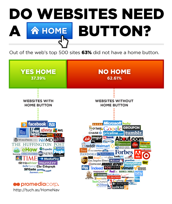
The survey yielded the following result:
Of the websites checked, 37.4% of them link to the homepage in their site navigation, while 62.6% do not.

Which side are you on?
*Only 436 of the Alexa top 500 returned data.

I purposely put a HOME text link back to the home page for my website. I did it so my customers can get back to the home page easily. But for the most part, I did it so I can get more links. I think that’s pretty important SEO-wise.
I help create the user interfaces for small business websites. These are small, low-trafficked sites that appeal primarily to local users – quite a bit different than the 500 most popular websites with their extensive content! We almost always include “Home” on the main navigation, because the target local audience includes users with different levels of computer knowledge. Often the main goal is get the user to call or come in to a physical location, so making sure there is an easy way to get “Home” (where the main info for the business is located) is important.
I usually use the top left logo or sitename in the page header as “Home” link; however it’s never labeled as “Home”. I think it’s expected by the visitor.
Just checked, and all sites in my currently open tabs do the same…
One of the first steps in the design process should include identifying your audience – and I really think this is an audience question.
The top sites get to build their own expectations to a degree – their users come back time and again, and learn the conventions on that site. Smaller sites might have only one chance to interact with a user, and may need to take them by the hand more.
I’ve been in GUI tests where users were definitely confused by the lack of a clear “home” button. Personally, I find them annoying (and the most annoying is when the home page itself has a vestigial “home” link). In time, I think the convention of logo=home will become completely standard. But I’m not convinced it’s there yet for everybody.
Certainly, I agree @Iris, a home-ward link is good link for the SEO juice – but that doesn’t have to be in the primary nav (footer links and other spots can accomplish that).
One other trick we’ve gotten some mileage out of is the logo that, when rolled-over, displays the word “home” in a contextually appealing way.
So, in your study, did you count a logo that links to the home page as using a home button? It could be that the sites have changed over time but I randomly selected 10 sites listed under the “No Home” column and each site’s logo linked to the home page.
Hi Janie- in the study we excluded logos that link to home. We only looked for the text “home” in the site’s primary nav – which we found out 35% of sites in the alexa top 500 at that time had. That was the question we were trying to answer. The study was conducted a few years back and we realize many of the sites have changed since then.