The Fluid Grid = Win for SEO and User Experience
This website is designed and built using a fluid grid. It will display properly on almost any screen resolution. It will render properly on mobiles, tablets, and Web enabled TV’s. No plugins required; no subdomains or mobile specific URLs (ie. mobile.promediacorp.com; promediacorp.com/mobile).
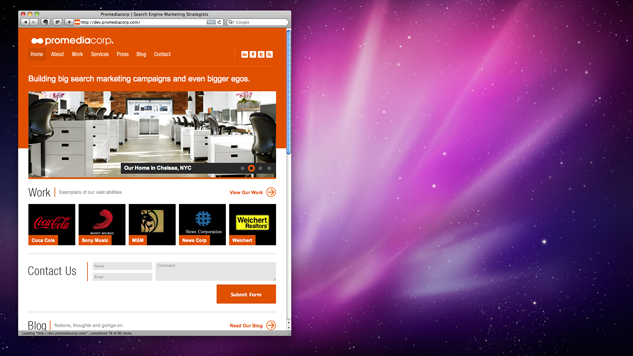
Resize your web browser window and you will see that the content on this page renders differently depending on the height and width, as seen in the short clip below:
This is how the homepage renders on a mobile handset, such as an iPhone:
This is how the homepage renders on a tablet (portrait orientation), such as an iPad:
This is how the homepage renders in a typical desktop view:
Responsive web design on a fluid grid eliminates the question of whether you need a mobile site. It eliminates the need to question placing a mobile version on a subdomain or subpath. It eliminates the concept of “mobile” version altogether. One version to rule all screens and displays. One version of URLs for users to link to. No loss of PageRank by users linking to your mobile site which a search engine may see as a separate site. No worrying about splitting link equity between your mobile site/pages and “regular” site/pages. No need to deal with duplicate content issues from having mobile specific or device specific URLs.
An evolution in web design? Perhaps. Thanks to the W3C, the new CSS3 specification allows designers to take advantage of media queries. In a nutshell, media queries allow the browser to detect the screen resolution of the user (and the max screen device width to detect for portrait or landscape) and applying the appropriate stylesheet. Note that we are not detecting for the presence of a particular device such as an iPhone or iPad. With that approach, there would be too many stylesheets to manage as the diversity of mobile devices increases. Multiply that by 2x when considering both portrait and landscape orientations for each.
By looking at the user’s available screen real estate, we can serve our site appropriately, thanks to the em property in CSS3. This allows us to define dimensions in terms of relative verses fixed. For example, the font size of the subheader is 1/2 that of the main header, as apposed to declaring the header 24 pixels, and the subheader 12px.
SEO friendly design and architecture is not just about creating a site that search engines can crawl, but creating a site that is designed to maximize it’s link equity. Take for example the following two URLs:
a) http://en.wikipedia.org/wiki/Abraham_Lincoln
and
b) http://en.m.wikipedia.org/wiki/Abraham_Lincoln
Wikipedia replicates it’s content on a subdomain to render properly for mobile browsers. A “disallow all” directive is used in the Wikipedia robots.txt file to prevent search engines from indexing the mirrored site, in addition to the “meta nofollow, noindex” tags. In this scenario users may link to either version a or b, when citing Wikipedia, however Wikipedia only receives benefit if users link to version a. All the link equity that is being passed to version b is being squandered. One might say that using a canonical tag, or a “noindex, follow” in the head of the document may fix this SEO issue. A band-aid solution that does not solve the user experience problem that is created.
Suppose that I decide to share Abraham Lincoln’s Wikipedia page with my friends from my mobile device. The link that I will be sharing will be version B. Assume the likelihood that the recipient is on a desktop – this is what they will be served:
This is a suboptimal user experience for my friend on his or her desktop. Should the Wikipedia have been designed on a fluid grid, the page would render properly for the desktop user. As you can see, it doesn’t.
Designing on the fluid grid is not only a win for SEO, but a win for the user experience.
Further Reading:
Responsive Web Design, A List Apart
Fluid Grids, A List Apart
The New Mobile SEO, Search Engine Land
[Thank you to Max, Rob, Vince, Jim, and crew at thelab for their tireless efforts figuring out how to get everything working right]


[…] Grid Layout resizing demo from ProMedia Corp […]
I think, maybe, you guys are confusing the subtle difference between a responsive design and a fluid grid. A fluid grid would imply, in my mind, that the size of containers resize with either a % or em width as the viewport changes. Typically using a max-width: XXem; on the main container. Responsive design, with media queries, like I’m seeing on this site, involves the shift and resizing as certain min/max width’s of the viewport are crossed. Like keyframes.
This site is a descent example of using both: http://rourkery.com/work if you resize you can see certain keyframes are hit and width’s shift and reposition, but between those keyframes, as you resize, you will just stretch elements–that’s the fluid grid.
Still, lovely site! Cheers!